Description
Description
Details
Details
Customize query in gerrit
| Status | Subtype | Assigned | Task | ||
|---|---|---|---|---|---|
| Open | None | T346974 Special:EventDetails UI / UX changes | |||
| Resolved | MHorsey-WMF | T318165 Make Special:EventDetails more similar to the prototypes | |||
| Duplicate | MHorsey-WMF | T332703 Update participants tab to match wireframes |
Event Timeline
There are a very large number of changes, so older changes are hidden. Show Older Changes
Comment Actions
@gonyeahialam Don't forget to add the latest design (especially for the behaviour of “Select all” label)
Comment Actions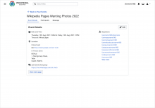
Since there is no longer a side widget beside the event details, I suggest having the organizer list by the side on desktop to take advantage of the horizontal space as shown below. What do you think @Daimona?
Comment Actions
Change 889543 merged by jenkins-bot:
[mediawiki/extensions/CampaignEvents@master] Make the participants list on EventDetails more similar to the proto
Comment Actions
@gonyeahialam I have a question about the participants tab: in the updated prototype, the "select all" checkbox was replaced by an unlabelled checkbox in the top left corner. However, as previously decided in T320635, there should be a label saying "$num out $total selected" that changes dynamically as you select participants. Where would that label be in the new version?
Comment Actions
Change 926044 had a related patch set uploaded (by Daimona Eaytoy; author: Daimona Eaytoy):
[mediawiki/extensions/CampaignEvents@master] Make Special:EventDetails more similar to the prototypes
Comment Actions
Still doing some research. It appears not to be on OOUI or Codex. But it is used in echo notifications for when your user rights change https://github.com/wikimedia/mediawiki-extensions-Echo/blob/master/modules/icons/user-rights-progressive.svg
Comment Actions
Thank you! I see that the "X out of Y selected" label would take the place of the "participants" header. However, this poses an accessibility issue where the header of the column no longer describes the content of the column. Would it be possible to reposition the label so that the "participants" header stays in place? Somewhat related, I wonder if the header should be "participant" instead of "participants", since each row only contains a single participant (also, compare with the other headers such as "age", "gender", "profession").
Ahhhhhh right, I knew I'd seen it somewhere before! It looks like this icon was made specifically for Echo. We can't use it directly, but maybe, since the icon is in the design style guide and on figma, it might make sense to add it to OOUI/Codex? That would have to be a separate task though.
Comment Actions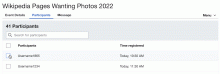
Thank you! I see that the "X out of Y selected" label would take the place of the "participants" header. However, this poses an accessibility issue where the header of the column no longer describes the content of the column. Would it be possible to reposition the label so that the "participants" header stays in place?
I would look into this. In my previous design last year, when you select an item a header appears at the top showing the number of items selected(view the gif below) but some technical concerns were raised which led us to decide not to go in that direction. This was also the time we decide on the "$num out $total selected" format. Can we still explore this interaction as a solution to the issue you have raised, this is a popular interaction used for batch selection in many applications? @Daimona
Somewhat related, I wonder if the header should be "participant" instead of "participants", since each row only contains a single participant (also, compare with the other headers such as "age", "gender", "profession").
My initial thinking was that the column had multiple participants so plural would be more appropriate but I understand what you are saying. We could go with Participant. Alternatively, a more appropriate term now that we have a full table with multiple columns of participants' information would be Username which accurately describes the exact information like other column headers, what do you think?
Ahhhhhh right, I knew I'd seen it somewhere before! It looks like this icon was made specifically for Echo. We can't use it directly, but maybe, since the icon is in the design style guide and on figma, it might make sense to add it to OOUI/Codex? That would have to be a separate task though.
Why are you unable to use it directly?
How do you intend to use it?
Comment Actions
I think this would be technically doable (since the selection already requires JS), but I'm also unsure about the accessibility of this option, because we would be removing the section header. Would it be possible to put the "interactive" header below the existing "X participants" header?
Somewhat related, I wonder if the header should be "participant" instead of "participants", since each row only contains a single participant (also, compare with the other headers such as "age", "gender", "profession").
My initial thinking was that the column had multiple participants so plural would be more appropriate but I understand what you are saying. We could go with Participant. Alternatively, a more appropriate term now that we have a full table with multiple columns of participants' information would be Username which accurately describes the exact information like other column headers, what do you think?
Good point. Out of curiosity, I went looking for other tables in recently-written MediaWiki code that also have a column of usernames. The only example I could find is CheckUser's ComparePager (used in Special:Investigate), which indeed uses "Username". I guess this really doesn't matter much, but yes, "Username" sounds good to me.
Ahhhhhh right, I knew I'd seen it somewhere before! It looks like this icon was made specifically for Echo. We can't use it directly, but maybe, since the icon is in the design style guide and on figma, it might make sense to add it to OOUI/Codex? That would have to be a separate task though.
How do you intend to use it?
If the icon is added to OOUI and Codex, we'd be able to use it normally like any other icon. However, adding the icon to OOUI would need a separate task for OOUI maintainers to decide if they want it or not.
Comment Actions


Out of all the solutions I explored, the third one seems to be the most effective and user-friendly approach to address our design challenge.
We can also remove the white background, giving us this:

Update on our previous discussion on displaying the count of selected participants on the participant list, along with other related batch actions
We discussed that we build upon what is currently implemented as shown below
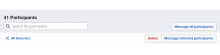
We discussed the idea of adding a 'Message Participant' button next to the 'Remove' button in the existing table as shown below. However, now that our table has more information(PII) with headers that also have a 'Select All' checkbox, this approach would result in duplicating the 'Select All' actions as shown below.
Explorations
To address this, I explored various alternative solutions.
NB: It is important to note that initially the message action only showed when a participant has been selected but from the usability testing report from YUX last year it was stated that it was confusing to users because they didn’t easily realize they could message participants when asked to do so. This is why we have the Message action always showing by default without having to select a participant.
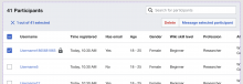
Idea 1: Moving all the elements in the page header to the top, as depicted below. Although it would minimize the header size, it would alter the table length and row positions each time a participant is selected, potentially disorienting users. Also, if all participants are selected, it would result in two 'Message All Participants' buttons, which would be redundant.
Idea 2:Adding a new row to the page header showing the count of selected items and their actions, without moving the other components in the header, as illustrated in image below. This shares the same issues as the first idea and would also extend the page header's length.
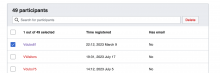
Idea 3:
The third idea is to move the search bar to the top, remove the seldom-used 'Delete' button (since its usage is rare, organizers will discover it upon participant selection), and move the 'Message' button to the left, as shown in image 3. When a selection is made, the 'Message All Participants' button is replaced by the header that indicates the number of selected participants and their related actions. This approach works because if specific participants are selected, the user probably does not want to message all participants. However, if they change their mind, they can close the selection header or select all participants and click 'Message Selected Participants'.
Out of all the solutions I explored, the third one seems to be the most effective and user-friendly approach to address our design challenge.
We can also remove the white background, giving us this:
Let me know if there are any technical challenges with this approach or any other considerations I should take into account. If not, support to move forward.
Looking forward to your feedback.
cc @Daimona
Comment Actions
Thank you, this looks good to me. I haven't looked deeply into the technical feasibility, but I don't see any obvious challenge.
Comment Actions
Change 926044 merged by jenkins-bot:
[mediawiki/extensions/CampaignEvents@master] Make Special:EventDetails more similar to the prototypes
Comment Actions
Change 927191 had a related patch set uploaded (by Mhorsey; author: Mhorsey):
[mediawiki/extensions/CampaignEvents@master] Implement email sending interface
Comment Actions
Change 935438 had a related patch set uploaded (by Daimona Eaytoy; author: Daimona Eaytoy):
[mediawiki/extensions/CampaignEvents@master] Fix overflow and spacing issue in Special:EventDetails
Comment Actions
Change 935438 merged by jenkins-bot:
[mediawiki/extensions/CampaignEvents@master] Fix overflow and spacing issue in Special:EventDetails
Comment Actions
Change 935807 had a related patch set uploaded (by Daimona Eaytoy; author: Daimona Eaytoy):
[mediawiki/extensions/CampaignEvents@master] Use userRights icon in Special:EventDetails
Comment Actions
Change 935807 merged by jenkins-bot:
[mediawiki/extensions/CampaignEvents@master] Use userRights icon in Special:EventDetails
Comment Actions
Change 936127 had a related patch set uploaded (by Daimona Eaytoy; author: Daimona Eaytoy):
[mediawiki/extensions/CampaignEvents@master] Make the participants table an HTML table
Comment Actions
Change 936290 had a related patch set uploaded (by Daimona Eaytoy; author: Daimona Eaytoy):
[mediawiki/extensions/CampaignEvents@master] Minor layout improvements for the message tab
Comment Actions
Change 927191 merged by jenkins-bot:
[mediawiki/extensions/CampaignEvents@master] Implement email sending interface
Comment Actions
Change 936127 merged by jenkins-bot:
[mediawiki/extensions/CampaignEvents@master] Make the participants table an HTML table
Comment Actions
Change 936290 merged by jenkins-bot:
[mediawiki/extensions/CampaignEvents@master] Minor layout improvements for the message tab
Comment Actions
Noting that the remaining things to do here are to implement the latest version of the participants tab (the one where the "select all" label is in its own row), and maybe more adjustments for the message tab.
Comment Actions
Change 939735 had a related patch set uploaded (by Mhorsey; author: Mhorsey):
[mediawiki/extensions/CampaignEvents@master] Make changes to participants tab to reposition the "Select all" label and buttons
Comment Actions


I am making some notes about this and @gonyeahialam may have more, but maybe we can talk about this in the Engineering / Design sync too - the only AC is Special:EventDetails should be updated so that it matches the latest wireframes and the ticket is nearly a year old and things have changed since it was written, so it would be good to chat about this. Maybe some of the things I am noting here should be put on separate tickets?
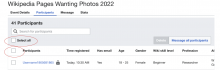
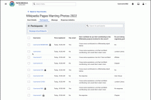
In the comp if one participant is selected there is a blue icon beside of the {x} out of {x} selected but that does not occur in the build unless Select all is checked and then participants are removed.
Build:
Gif of build:
In addition, I am not fully sure how the {x} out of {x} selected is supposed to work in conjunction with the blue check beside of the Username here, but as also mentioned above, there is a discrepancy between the comp and the build:
Comp
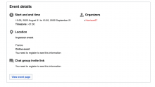
In the comp the Organizers side of this tab is floated further to the right.
Comp:
For In-person and Online events, Online events are displayed first in the comp.
Comp:
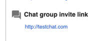
The title is Join event chat group in the comp but is Chat group invite link in the build:
Comp:
@gonyeahialam let me know if you have any thoughts on these or if any of what I mentioned here is out of date. I am comparing the current build on betacluster to the comps as linked in this comment, but if I don't have the most up to date information then just let me know, and we can chat about this in eng / design sync too.
Comment Actions
@vaughnwalters, I am not sure what blue icon you are referring to here. Is it the X icon beside the {x} out of {x} selected in the design or the indeterminate checkbox icon [-]? Note that this updated design is related to the messaging feature, from the build screenshots you have shown, messaging hasn't been implemented. Maybe the updates will be made in conjunction with the messaging feature(and the addition of non-pii to the table)
In addition, I am not fully sure how the {x} out of {x} selected is supposed to work in conjunction with the blue check beside of the Username here, but as also mentioned above, there is a discrepancy between the comp and the build:
Comp
As shown in the design the {x} out of {x} selected should be separated from the Username title, it shouldn't replace it as shown in the build. The checkbox beside the Username title when clicked in its empty state selects all the participants, if only some participants are selected the checkbox beside the Username title transitions to an indeterminate state which is this icon [-]. The {x} out of {x} selected is shown above and when clicked returns the table back to its default state.
In the comp the Organizers side of this tab is floated further to the right.
Comp:
It looks like the build and design have the same distance between the two columns. Also, the edit button is missing in the build
For In-person and Online events, Online events are displayed first in the comp.
Comp:
Online should come before In-person but this isn't a hard requirement
The title is Join event chat group in the comp but is Chat group invite link in the build:
Comp:
It should be 'Join event chat group'
Comment Actions
Change 939735 merged by jenkins-bot:
[mediawiki/extensions/CampaignEvents@master] Reposition the "Select all" label and buttons
Comment Actions
@gonyeahialam I created some follow up tasks for a few things that still need corrected from the design comp:
T345594: Special:EventDetails tab subheader copy changes.
T345596: Special:EventDetail font changes.
T345593: Add tooltip to Participants tab header.
Since tickets have been made for these remaining differences, I am sending this ticket to design sign off.
Comment Actions
Do you mind sending a gif showing the latest implementation?
| Event details tab | Participants tab | gif |
Comment Actions
@vaughnwalters Looks good.
@Daimona The 'z' in 'Organizers' should be 's' as in 'Organisers'. It's an error on my part.
Comment Actions
The convention is to always use American English, see https://www.mediawiki.org/wiki/Manual:Coding_conventions#Preferred_spelling. If someone wants the interface in British English, they can change the language variant in their preferences. That's why we use "organizers" here and in other places.
Comment Actions
As the remaining QA findings have been contained in T346974, I'm marking this as Done.